


Dark mode is a nifty little functionality that allows users to access a web application with a dark-colored palette that is less straining on the eyes especially during the night time. But implementing dark mode has historically been a difficult task due to 3 main reasons :
- How do you maintain two different style templates for light and dark mode?
- How do you store the user's preference of theme?
- How do you toggle seamlessly between the two theme modes without any flicker?
In this tutorial, I'll explain how you can easily overcome these hurdles and implement dark mode using TailwindCSS and next-themes in your Next.js app.
Setup Next.js Project with TailwindCSS
For keeping it short and simple let's create a new Next.js app with TailwindCSS already configured using the official "with-tailwindcss" template provided by Next.js team using the following command:
yarn create next-app -e with-tailwindcss next-dark-mode
Note : If you want to manually configure tailwindcss in your project you can go through this guide.
Once the installation is complete, add next-themes package using the following command:
yarn add next-themes
Configure TailwindCSS for light/dark mode
Open tailwind.config.js present in the root of your app folder and make the following changes:
- Set
darkModeas 'class' which allows us to toggle manually between light and dark mode based on classes. - Define a custom color palette that extends over the default tailwindcss color palette based on your requirements. In this case, I have created a
primaryandsecondaryvariant for my light and dark mode colors to support my use case.
module.exports = {
  mode: 'jit',
  purge: ['./pages/**/*.{js,ts,jsx,tsx}', './components/**/*.{js,ts,jsx,tsx}'],
  darkMode: 'class',
  theme: {
    extend: {
      colors:{
        'light-primary':'#E5E7EB',
        'light-secondary':'#D1D5DB',
        'dark-primary':'#1F2937',
        'dark-secondary':'#111827'
      }
    },
  },
  variants: {
    extend: {},
  },
  plugins: [],
}
Now, go to _app.js and wrap the whole app inside ThemeProvider imported from next-themes:
import { ThemeProvider } from 'next-themes'
import 'tailwindcss/tailwind.css'

function MyApp({ Component, pageProps }) {
  return (
    <ThemeProvider  attribute='class' >
        <Component {...pageProps} />
    </ThemeProvider>
  )
}

export default MyApp
As you can see we have defined the attribute prop of ThemeProvider as 'class' which allows us to control the color theme of our app based on class attributes of different components.
Let's write Some markup
In pages/index.js add the following code:
import Head from 'next/head'
import { useEffect, useState } from 'react';
export default function Home() {
return (
<div className='bg-light-primary dark:bg-dark-primary h-screen'>
<Head>
<title>Next Dark Mode</title>
<link rel="icon" href="/favicon.ico" />
</Head>
<div className='p-10 text-dark-primary dark:text-light-primary'>
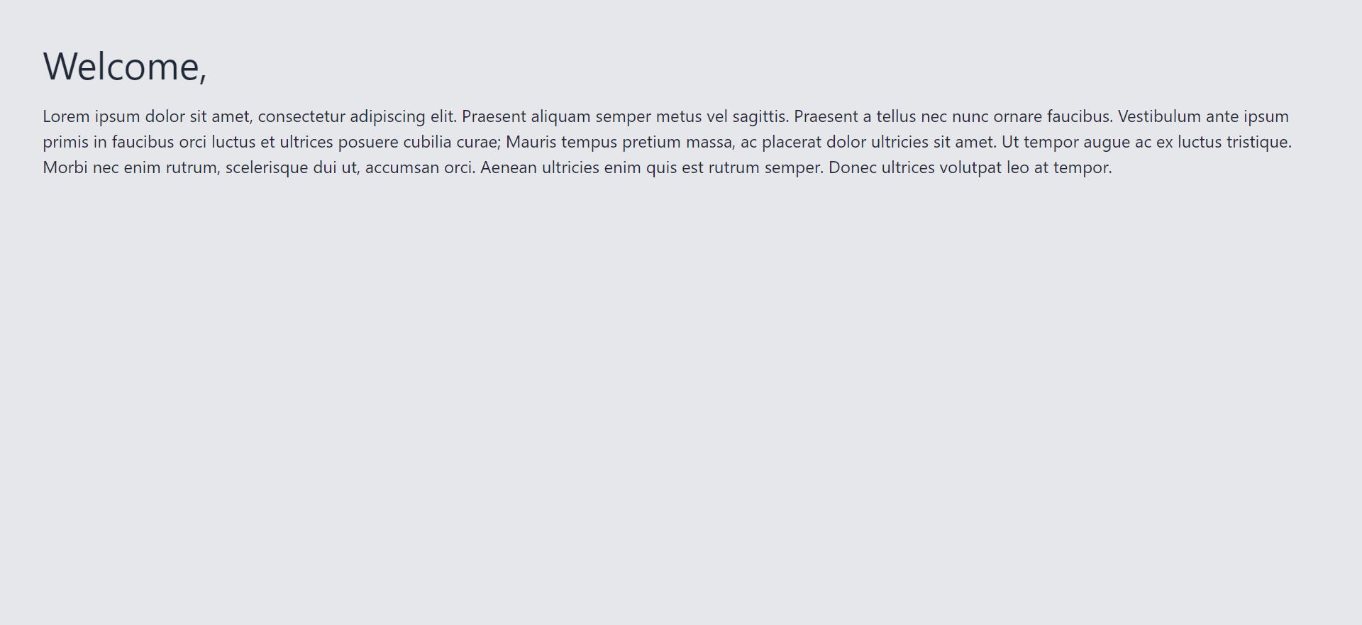
<span className='text-4xl'>Welcome,</span>
<p className='mt-4'>
Lorem ipsum dolor sit amet, consectetur adipiscing elit. Praesent aliquam semper metus vel sagittis. Praesent a tellus nec nunc ornare faucibus. Vestibulum ante ipsum primis in faucibus orci luctus et ultrices posuere cubilia curae; Mauris tempus pretium massa, ac placerat dolor ultricies sit amet. Ut tempor augue ac ex luctus tristique. Morbi nec enim rutrum, scelerisque dui ut, accumsan orci. Aenean ultricies enim quis est rutrum semper. Donec ultrices volutpat leo at tempor.
</p>
</div>
</div>
)
}
There are 2 key points to note here:
- We have made use of our custom color palette by spending color after
bg-,text-orborder-. - Styles for dark mode are defining by using the utility class
dark:as a prefix.
This will render the UI as shown below:
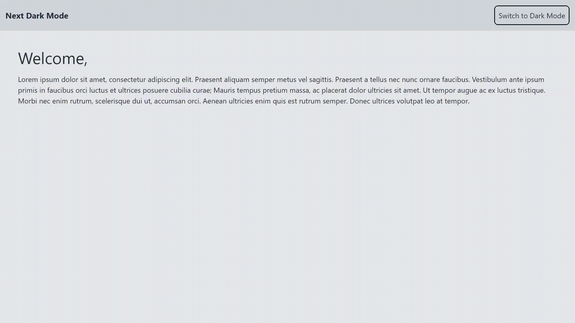
Toggle between light and dark mode
Finally Let's create a Navbar with a toggle button for switching between light and dark mode. In components/Navbar/index.js add the following code:
import { useTheme } from 'next-themes'

const Navbar=()=>{
  const {theme,setTheme}=useTheme();


  return(
    <div className='flex justify-between p-3 bg-light-secondary dark:bg-dark-secondary text-dark-primary dark:text-light-primary'>
      <div className='font-bold my-auto text-lg'>
        Next Dark Mode
      </div>
      <div>
        <button onClick={()=>setTheme(theme=='light'?'dark':'light')} className='border-2 border-dark-primary dark:border-light-primary rounded-lg p-2'>
          Switch to {theme=='light'?'Dark Mode':'Light Mode'}
        </button>
      </div>
    </div>
  )
}

export default Navbar
Here you can see we are making use of the useTheme hook provided by next-themes library to toggle the state between 'light' and 'dark'. Internally the setTheme hook stores this state in the localStorage and next-themes will use that preference on reloading.
Now simply use this component inside pages/index.js. VOILA! You have created a simple Next.js app with Light/Dark mode functionality.
Github Repo Link : https://github.com/anishm10/next-dark-mode